Innovating rentals with seamless, customer-first solutions
Client:
Deliverables:
National is an international car rental brand owned by Enterprise Holdings, along with Enterprise and Alamo. It is the largest rental car holding company in the U.S., with a 40% market share.
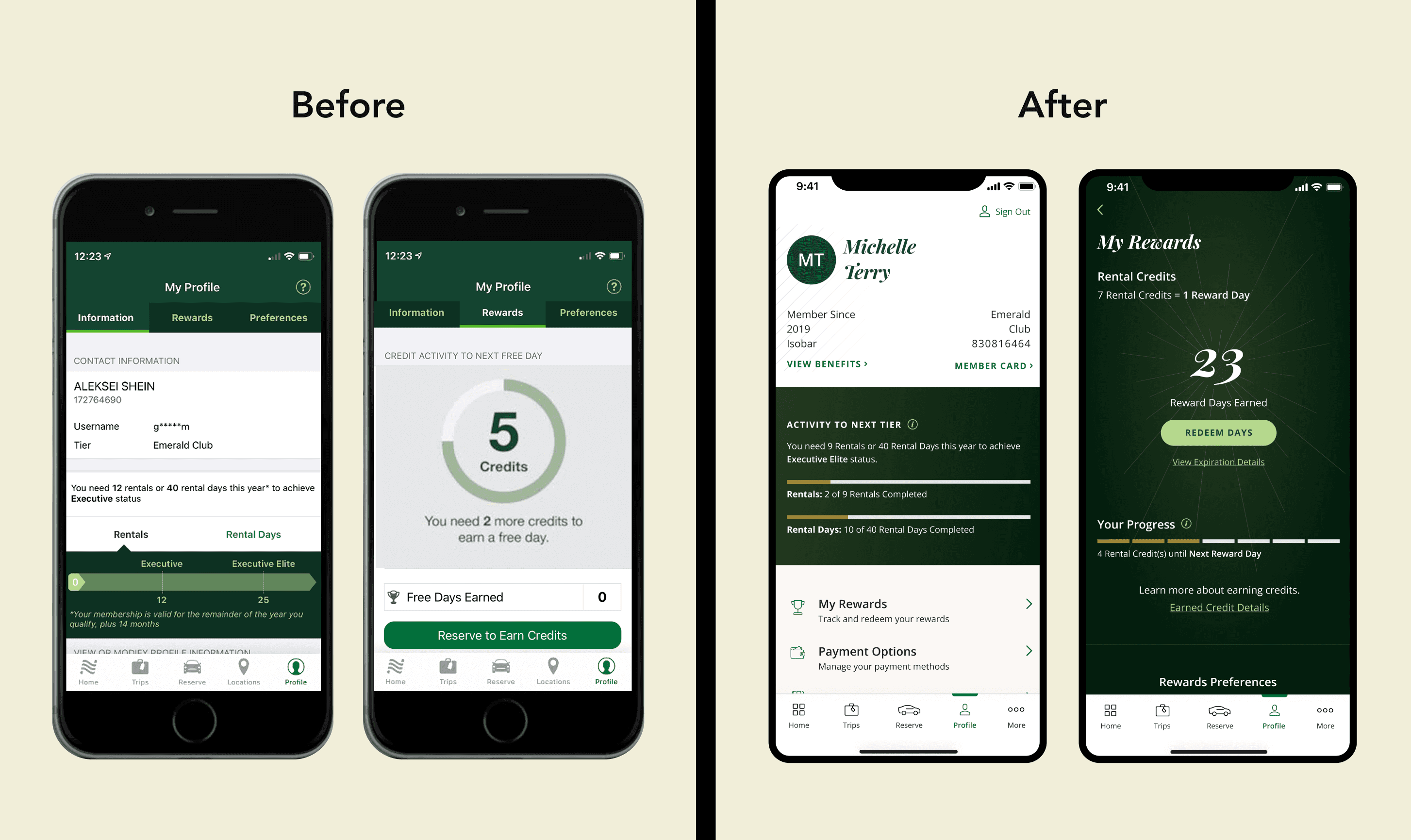
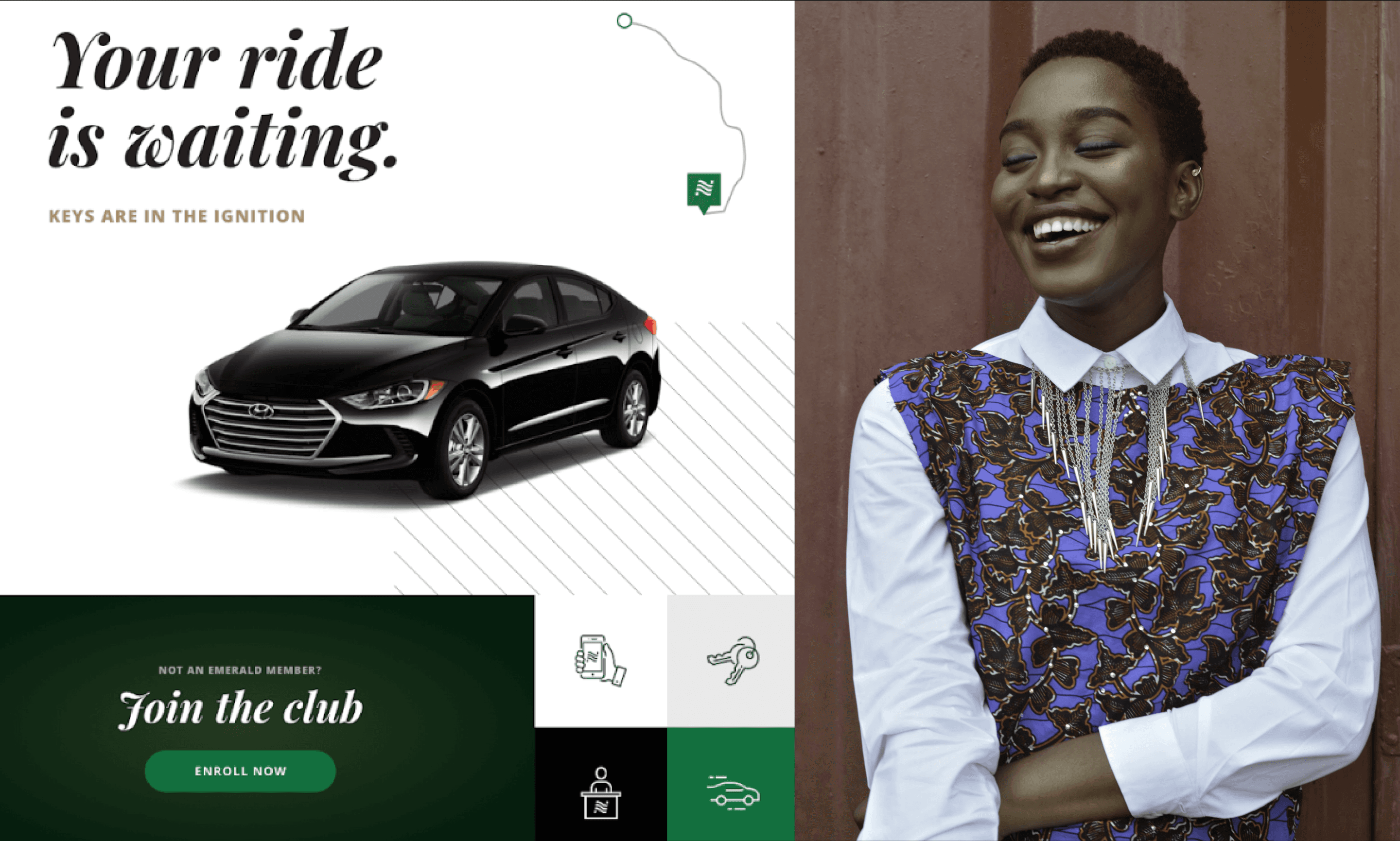
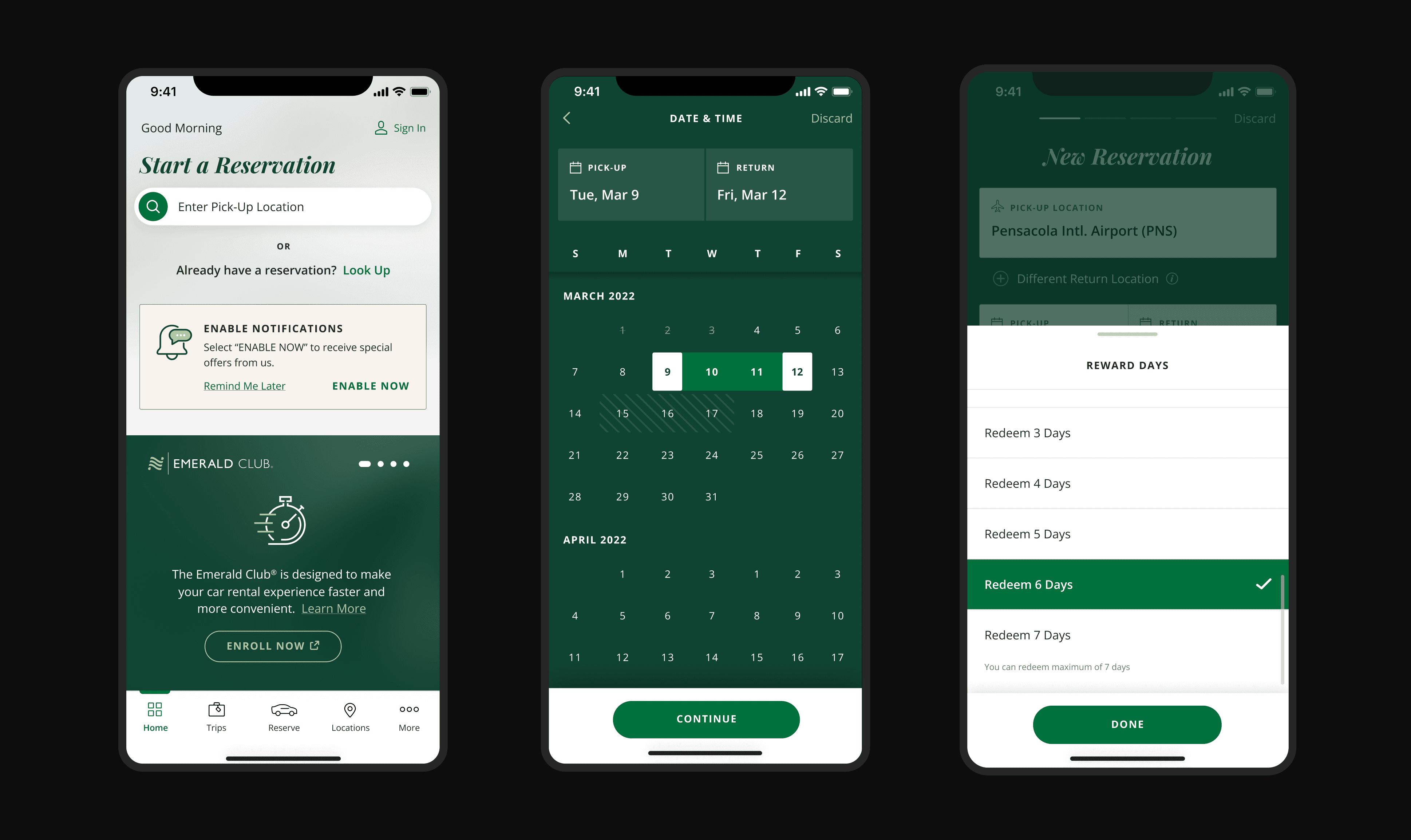
The National Mobile App’s outdated design and technology hurt its premium image for VIP and corporate clients. Technical issues and limitations caused problems with car reservations and blocked new features like express booking and map view. The ask was to create a comprehensive experience that resolved existing issues while incorporating stakeholder feedback and prioritizing customer needs.
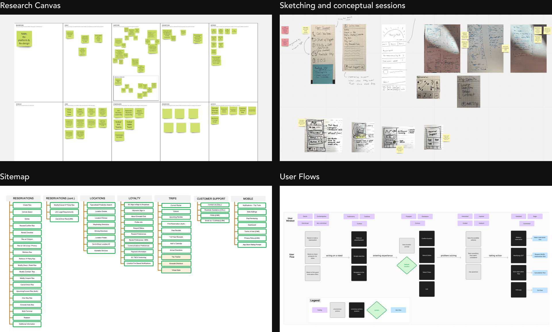
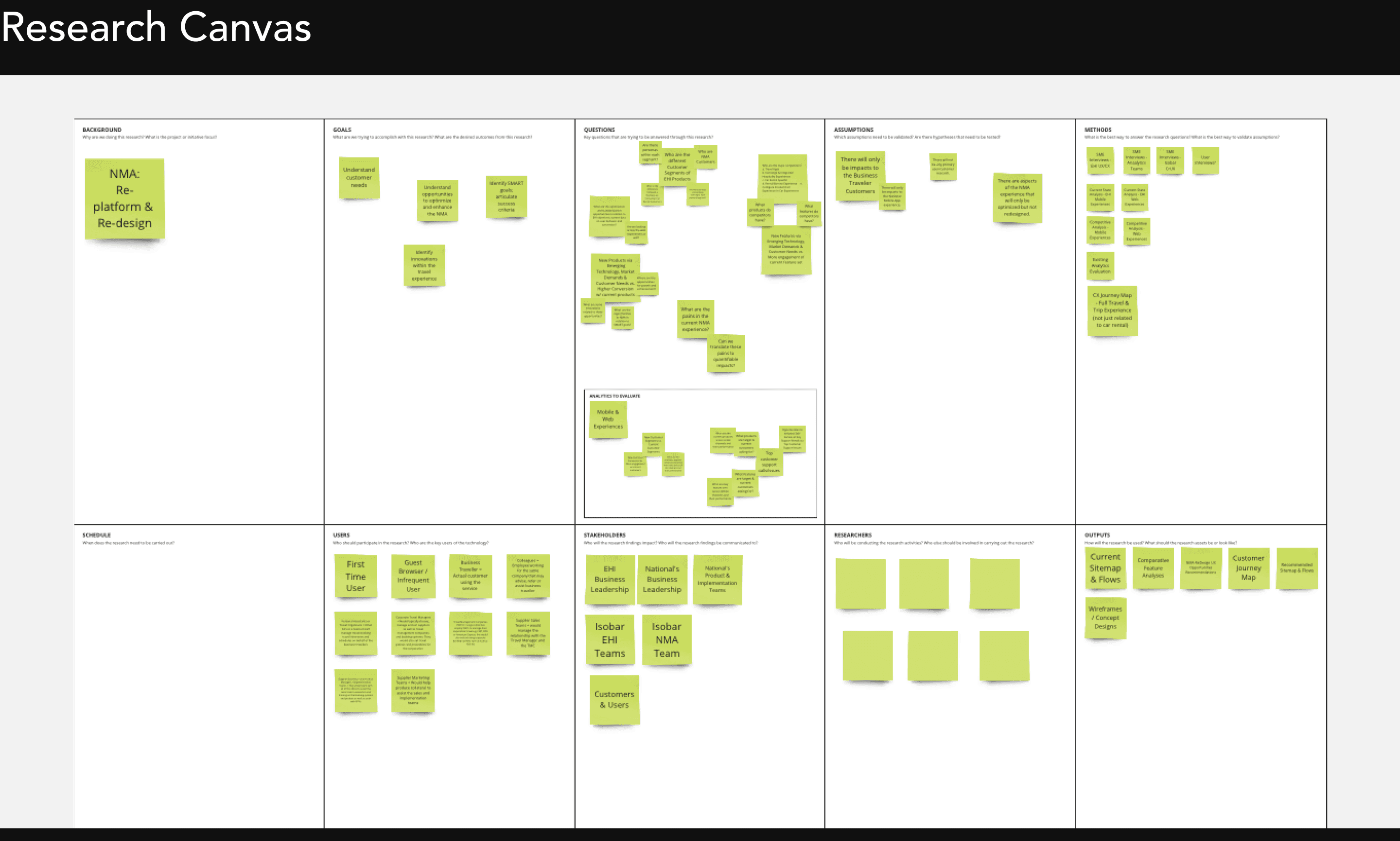
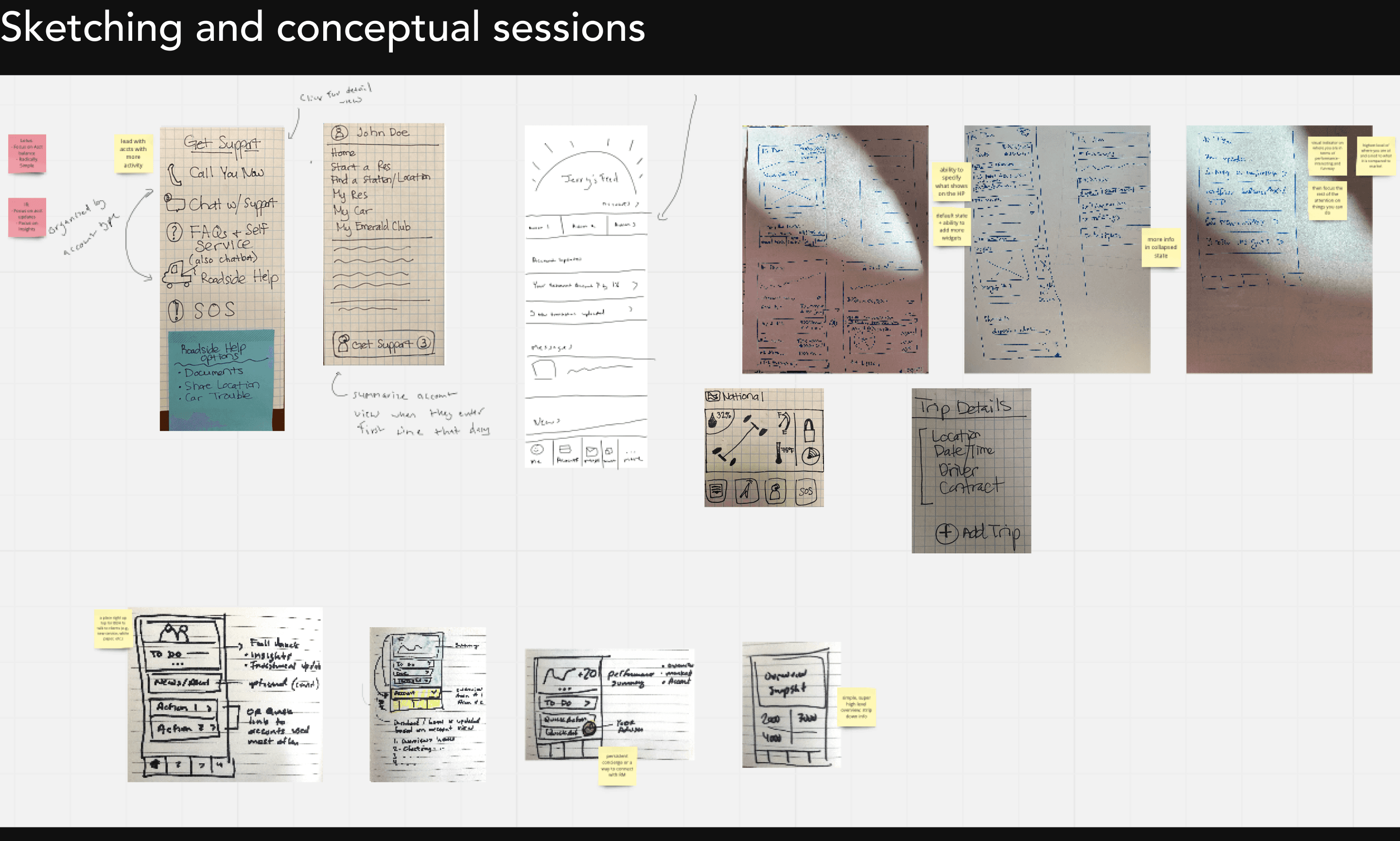
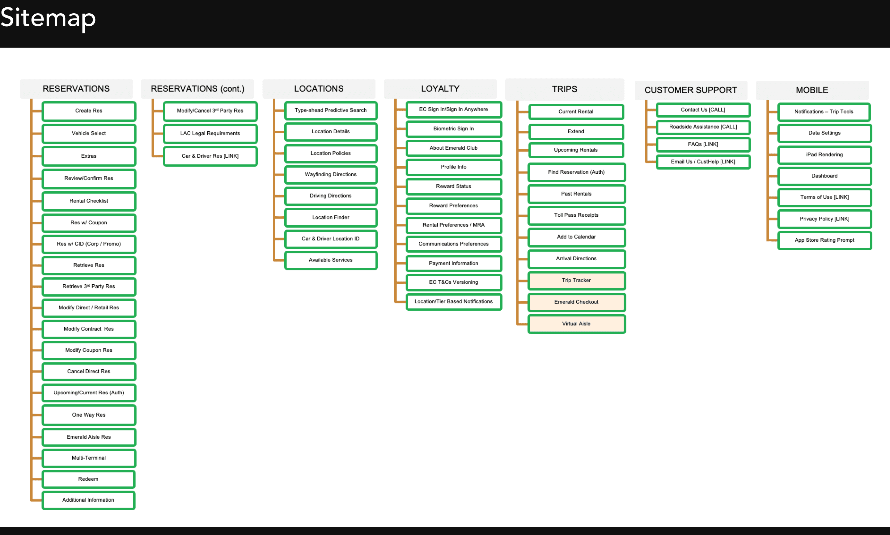
To kick off the redesign, I conducted extensive research to understand user pain points and business goals. As part of this process, I created a sitemap and user journeys to map out the existing experience and identify friction points. This helped uncover gaps and align with both user needs and business objectives.
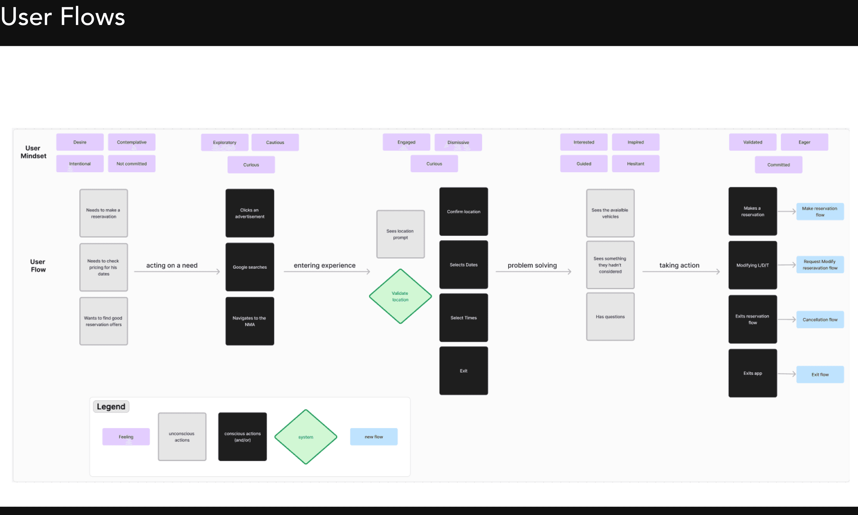
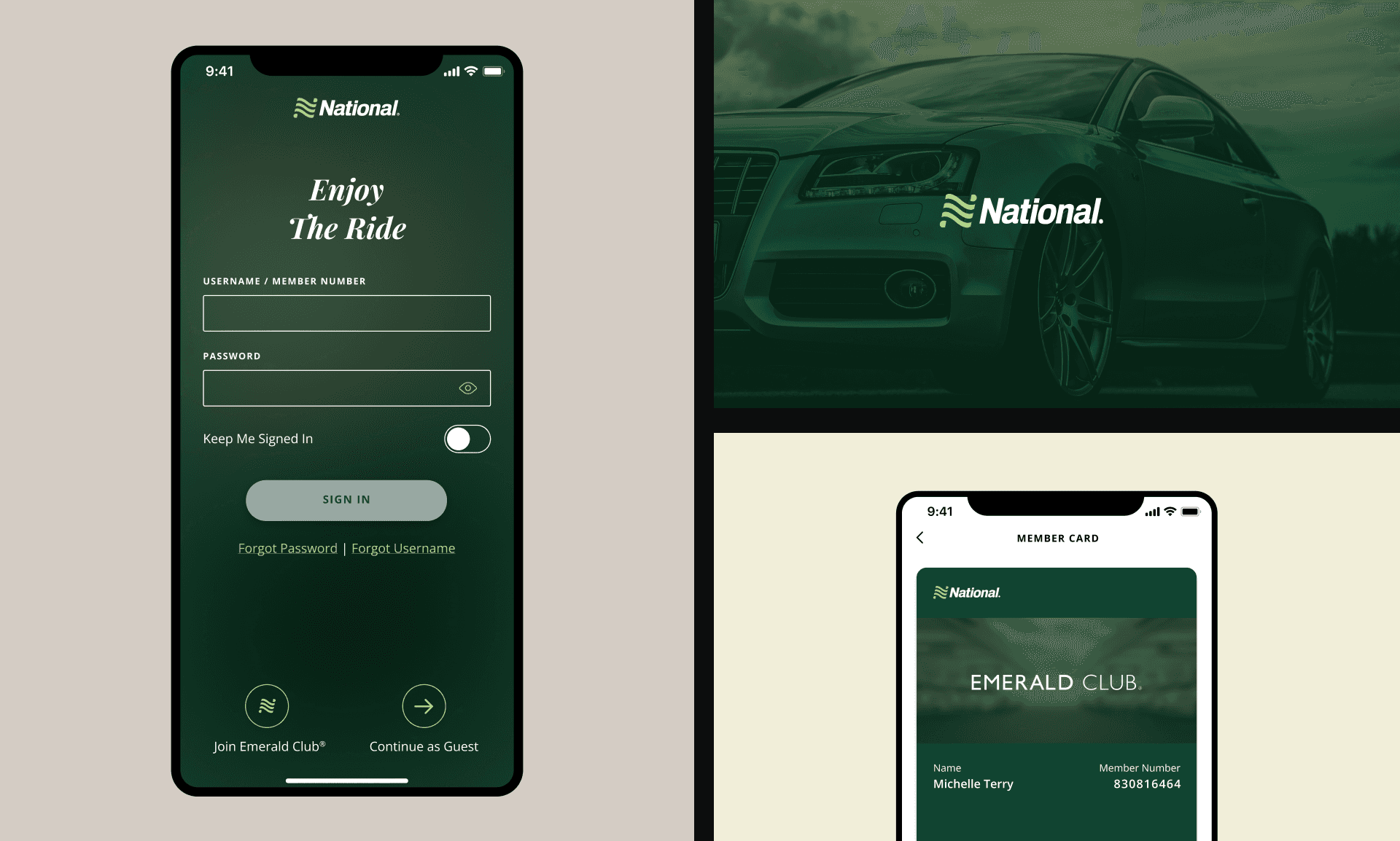
Together with strategy team, I developed user personas to guide design decisions, with a strong focus on power users who drive the majority of interactions. The key persona was Michelle, a frequent business traveler, who values efficiency, quick access to reservations, and a seamless pickup experience. Since power users like Michelle have high expectations for speed and convenience, every design decision—from navigation to micro-interactions—was tightly aligned with their needs.
Keeping user needs in mind, I created wireframes to establish a clear and intuitive app structure. Each section of the sitemap was turned into a detailed wireframe flow, ensuring a smooth and logical experience. This step laid the foundation for the visual design phase, where layouts, interactions, and branding were refined. The full experience was then tested and validated to ensure smooth and intuitive experience for users.
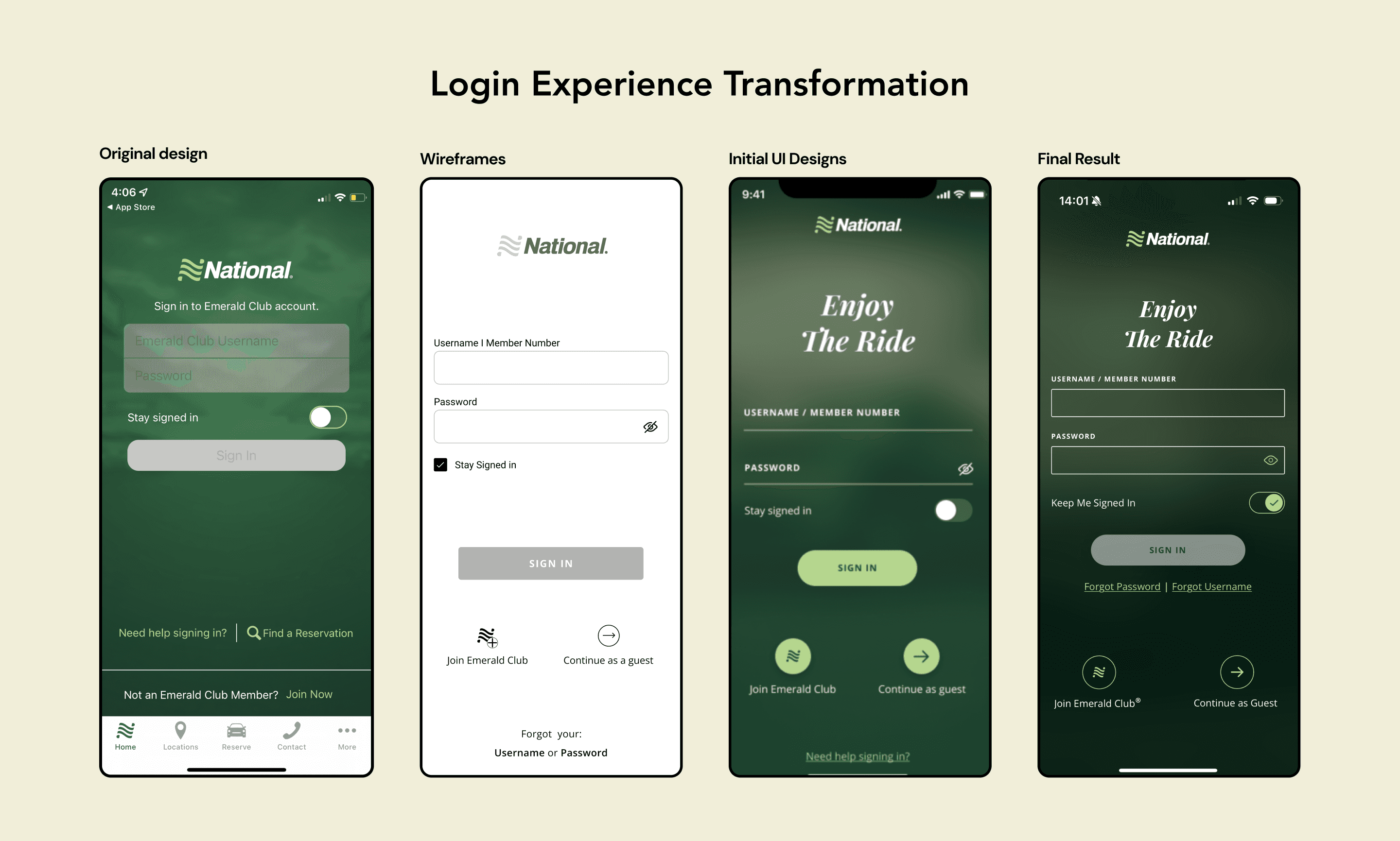
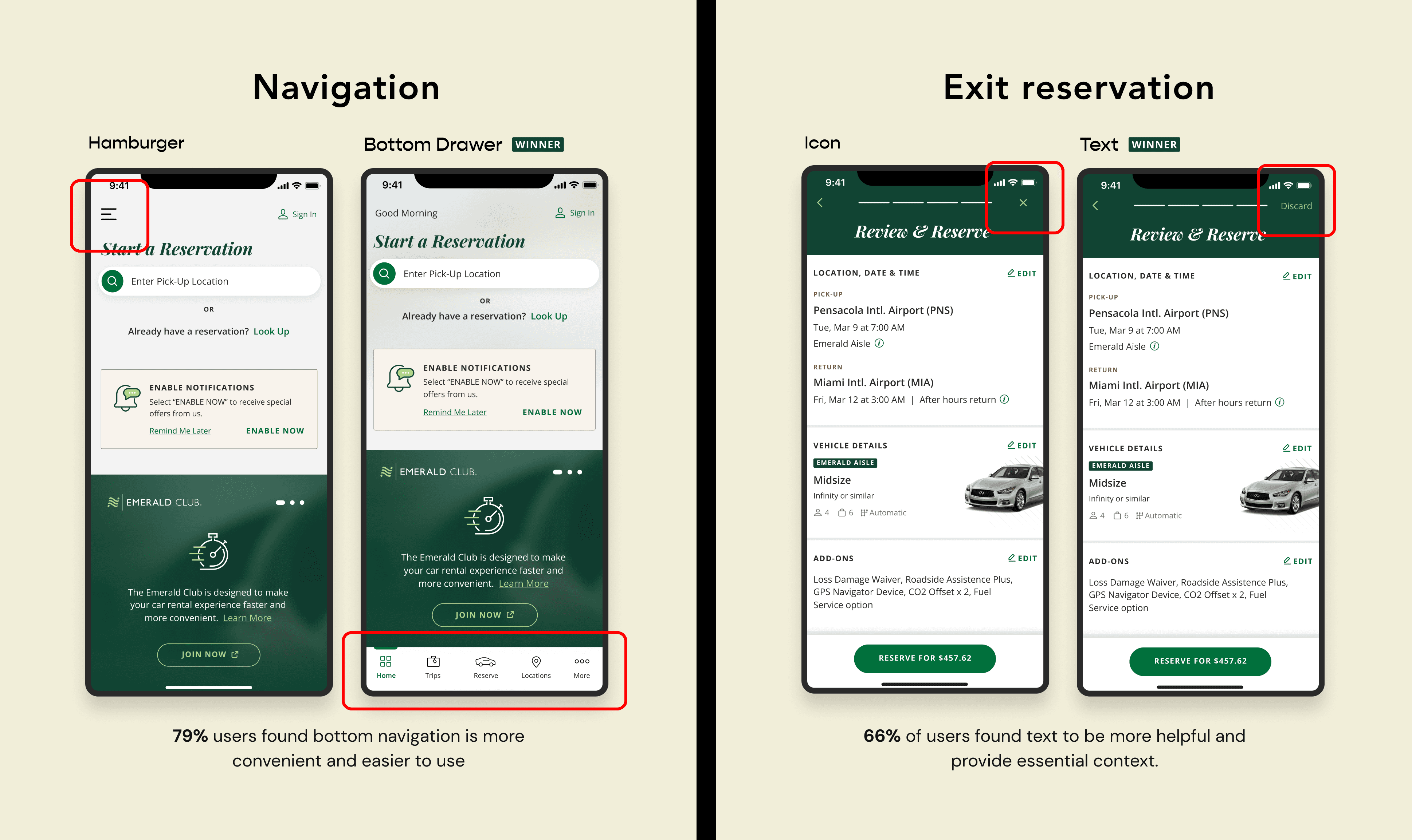
The team and I conducted meticulous A/B testing to compare design variations and see which performed best. We focused on small changes like button placement and color schemes, ensuring clear metrics and controlled conditions. This helped us make data-driven decisions to continuously improve the user experience.
During handoff, I provided clear annotations along with all design files and specifications for the development team. QA testing followed to ensure the design was accurately implemented. We continuously reviewed user feedback, identifying areas for improvement. This ongoing process of iteration and refinement allowed us to keep enhancing the user experience.


Results
The app redesign and launch took 15 months, resulting in a smoother, more intuitive experience. Based on customer reviews and internal research, users praised the improved navigation and streamlined booking process. The redesign successfully addressed key pain points, leading to higher engagement and satisfaction.
important numbers
Drop in bounce rate